May 6, 2026
How to Compare Poly Furniture Colors
How to Compare Poly Furniture Colors
Choosing poly furniture colors is one of the most important parts of planning an outdoor space. The right color can make a front porch feel more welcoming, a patio feel more finished, a dining area feel more intentional, or a commercial space feel more professional.
Poly furniture is available in a wide range of color options, which gives you more flexibility than many traditional outdoor furniture materials. But that flexibility can also make the decision harder. A color that looks great online may feel different in person. A bold color may look perfect on one patio but too strong in another setting. A neutral color may blend beautifully with one home and feel flat next to another.
The best way to compare poly furniture colors is to think about the full outdoor space: the home or building, patio surface, landscaping, lighting, furniture style, and how the space will be used.
Why Poly Furniture Color Matters
Poly furniture is built for long-term outdoor use, so color is not a small decision. These pieces may become part of your porch, patio, deck, fire pit area, dining space, campground, church, school, business, or hospitality patio for years.
Color affects:
- Curb appeal
- Outdoor style
- How large or small the furniture feels
- How formal or casual the space looks
- Whether the furniture blends in or stands out
- How well pieces coordinate together
- How the space feels to guests, customers, or family
Because poly furniture is often chosen for long-term value, it is worth taking time to compare colors before buying.
Start with the Space, Not the Color
The best color choice starts with the space itself.
Before choosing a favorite color, look at the surrounding materials and features. Poly furniture should feel like it belongs in the outdoor setting.
Consider:
- House or building exterior
- Trim color
- Front door color
- Patio or deck surface
- Stone, concrete, gravel, or pavers
- Landscaping
- Fence color
- Outdoor lighting
- Umbrellas or shade structures
- Existing outdoor furniture
- Business, church, school, or brand colors
A color may look good on its own but feel wrong next to the full outdoor environment. Comparing colors against the actual space helps you make a better decision.
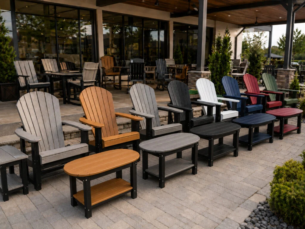
Compare Colors in Person When Possible
The best way to compare poly furniture colors is to see them in person. Online photos are helpful, but colors can shift depending on screen brightness, camera settings, lighting, shadows, and surroundings.
When you compare colors in person, you can see how they look in natural light and how they feel next to other furniture pieces.
This is one of the biggest reasons to visit a local dealer before buying. Read Why Shop Poly Furniture In Person Before You Buy to understand how in-person shopping helps with comfort, scale, table height, and color selection.
You can also use Shop Local to find a Kanyon Poly dealer near you.
Use Color Samples When Available
Color samples can help you compare options more accurately before choosing a full furniture set.
Samples are especially useful when you are trying to match or coordinate with:
- Siding
- Brick
- Stone
- Decking
- Concrete
- Pavers
- Trim
- Doors
- Outdoor rugs
- Commercial branding
- Existing patio furniture
If samples are available, compare them outdoors instead of only under indoor lighting. Natural light gives a better sense of how the color will look in the actual space.
Start with the Samples category if you want to compare color options before making a larger furniture decision.
Think About Neutral Colors
Neutral colors are a safe and versatile choice for many outdoor spaces.
They work well if you want the furniture to feel clean, timeless, and easy to coordinate. Neutral colors can also help the landscaping, architecture, or outdoor decor stand out.
Neutral poly furniture colors are often a good fit for:
- Front porches
- Traditional homes
- Modern patios
- Commercial spaces
- Church courtyards
- Campgrounds
- Hospitality patios
- Community spaces
- Outdoor dining areas
Neutral colors can make a space feel polished without drawing too much attention to the furniture itself.
Think About Bold Colors
Bold colors can make poly furniture feel fun, memorable, and full of personality.
A bright color may be a great choice for a family patio, poolside space, campground, school area, community space, or casual outdoor gathering area. Bold colors can also help a business or organization create a recognizable outdoor experience.
Bold colors work especially well when:
- The surrounding space is neutral
- The furniture is meant to stand out
- The area is family-friendly
- The patio needs more energy
- The color connects to a brand or school
- The outdoor space is used for social gatherings
If you choose a bold color, consider using it intentionally. A few bold pieces can add personality without overwhelming the full layout.
Consider Two-Tone Poly Furniture
Two-tone poly furniture can help you create a more custom and coordinated look.
A two-tone setup may use one color for the frame and another for the seat, back, tabletop, or accent areas. This can help connect the furniture to multiple colors in the surrounding space.
Two-tone furniture can work well when you want to coordinate with:
- House siding and trim
- School colors
- Church colors
- Business branding
- Patio materials
- Outdoor decor
- Umbrellas
- Landscaping features
Two-tone combinations can make the furniture feel more designed and intentional.
Match the Color to the Outdoor Style
Different colors create different moods.
A clean neutral color may make a patio feel calm and classic. A bright color may make a fire pit area feel social and fun. A darker color may feel bold and grounded. A lighter color may feel fresh and open.
Before choosing, decide what the space should feel like.
Ask:
- Should the space feel calm or colorful?
- Should the furniture blend in or stand out?
- Should it feel traditional or modern?
- Should it feel playful or professional?
- Should it match the home or create contrast?
- Should it support a brand, school, church, or property identity?
The best color is not always the loudest or safest option. It is the one that supports the purpose of the space.
Color Tips for Front Porches
Front porch furniture affects curb appeal. It is often visible from the street and becomes part of the first impression of the home.
For front porches, consider colors that coordinate with:
- Siding
- Trim
- Front door
- Porch floor
- Railings
- Shutters
- Landscaping
- Seasonal decor
Neutral colors are often a strong choice for a classic front porch. Bold colors can also work well if they tie into the door color, flowers, planters, or trim.
If you are planning a porch setup, read Best Poly Furniture for Front Porches for layout and furniture ideas.
Color Tips for Patios
Patios often give you more room to use color creatively.
A patio may include dining furniture, lounge seating, fire pit chairs, umbrellas, rugs, planters, lighting, and outdoor decor. Color can help connect all of those pieces.
For patios, consider:
- Concrete, stone, pavers, or decking
- Nearby landscaping
- Outdoor dining table color
- Chair color
- Umbrella color
- Fire pit material
- Existing decor
- Whether the space is formal or casual
A coordinated color plan can make the patio feel like an extension of the home.
Color Tips for Outdoor Dining Areas
Outdoor dining spaces should feel clean, comfortable, and coordinated.
Because dining tables are often larger pieces, their color can set the tone for the whole area. A neutral table with colorful chairs can feel balanced. A bold table with neutral chairs can make a statement. A two-tone dining set can help tie together the home, patio, and surrounding decor.
If you are choosing dining furniture, think about how the table and chairs will look together.
For more dining-specific guidance, read How to Choose the Right Poly Outdoor Dining Table.
Color Tips for Fire Pit Areas
Fire pit areas are usually built for gathering, conversation, and comfort.
Earth tones, neutrals, and darker colors can blend well with stone, gravel, pavers, and landscaping. Brighter colors can make the space feel casual and social.
When choosing colors for a fire pit area, consider:
- Fire pit material
- Patio surface
- Landscape rock or mulch
- Outdoor lighting
- Seating layout
- Whether the area should feel rustic, modern, or playful
A repeated chair color around a fire pit can make the space feel more organized and inviting.
Color Tips for Commercial Spaces
Commercial spaces need colors that support the property’s look and purpose.
For businesses, campgrounds, churches, schools, hospitality patios, and community spaces, color can help reinforce identity and create a consistent experience.
Consider colors that match or coordinate with:
- Brand colors
- Signage
- Building exterior
- School or church colors
- Cabin colors
- Patio materials
- Landscaping
- Outdoor umbrellas
- Pool or playground colors
For commercial spaces, consistency often matters. Repeating colors across multiple seating areas can make the property feel more professional and intentionally designed.
Compare Colors at Different Times of Day
Outdoor colors can look different in morning light, full sun, shade, and evening light.
If possible, compare color samples or furniture pieces at different times of day. A color that looks subtle in shade may look brighter in direct sun. A darker color may feel richer in evening light. A lighter color may look crisp in full sun but softer under a covered porch.
Lighting changes the way color feels, so outdoor comparison is more helpful than indoor guessing.
Avoid Choosing Color from a Screen Alone
Online photos are useful, but they should not be the only factor in a color decision.
Screens can change color based on brightness, contrast, display settings, and photography. A color may look slightly different on a phone, tablet, laptop, or desktop monitor.
Use online images to narrow your choices, then compare in person or with samples when possible.
A local dealer can help with this. Read How to Choose a Local Poly Furniture Dealer to learn what to look for when shopping locally.
Match Color to Furniture Type
Some colors feel different depending on the furniture piece.
A bold color on a small side table may feel fun. The same color on a large dining table may feel much stronger. A dark color on a chair may feel grounded. A light color on a full outdoor dining set may feel bright and open.
When comparing colors, think about the size and number of pieces:
- One accent chair
- A pair of porch chairs
- A full dining set
- A fire pit circle
- Multiple tables across a business patio
- A large campground or church layout
The more pieces you use, the more impact the color will have.
Think About Long-Term Style
Poly furniture is built for long-term outdoor use, so choose colors you will still like years from now.
Trendy colors can be fun, but timeless colors may be easier to live with long term. If you want a bold look, consider using bold colors on accent pieces or smaller areas while keeping larger furniture pieces more neutral.
A balanced approach can help the space feel current without becoming hard to coordinate later.
Ask the Right Questions Before Choosing Colors
Before finalizing poly furniture colors, ask:
- What colors already exist in the space?
- Do I want the furniture to blend in or stand out?
- Will this color look good with the house or building?
- Will I still like this color several years from now?
- Should I use one color or a two-tone combination?
- Will this color work across multiple pieces?
- Does the color support the way the space should feel?
- Have I seen the color in person or compared a sample?
- Will this color work for both residential and commercial use?
- Does the color match my table, seating, and layout plan?
For a broader buying checklist, read What to Ask Before Buying Poly Outdoor Furniture.
Shop Poly Furniture Colors Online and Locally
A strong color decision often starts online and finishes in person.
First, browse the Shop Poly Outdoor Furniture collection to see available furniture types and styles. Then, use Shop Local to find a local dealer who can help you compare colors, comfort, and scale.
If you want to compare colors before choosing furniture, start with Samples.
Final Thoughts
Comparing poly furniture colors is about more than choosing a favorite shade. It is about creating an outdoor space that feels intentional, comfortable, and connected to the home, business, church, campground, or community setting.
Start with the space, compare colors in real light, think about one-tone and two-tone options, and choose colors that support the way the outdoor area will be used.
Whether you are planning a front porch, patio, outdoor dining area, fire pit space, or commercial layout, Kanyon Poly Furniture gives you color options built for real life outside.